This year, there are a few trends we are seeing amongst the colours of the year. While there is a mix of bold and neutral, they are all refreshing, and many are nature inspired, similar to last year.
Below you’ll see colours of the year from six popular companies. We’ve also put all these colours together for you to show how seamlessly they can all work together as one.
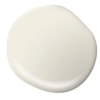
Behr has chosen Blank Canvas (DC-003) for this year’s colour of the year. This warm toned white works perfectly with almost every style and colour.
Blank Canvas is a great colour to renew your space with its beautiful and bright tone, and what it symbolizes and evokes. This versatile colour is welcoming, symbolizing a fresh start and looking forward to the future.
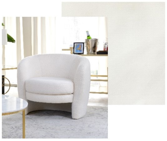
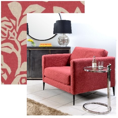
Benjamin Moore decided to choose something bolder, choosing Raspberry Blush (2008-30). This charismatic colour is a coral with hints of pink. It has a wow factor that they hope can take people out of their comfort zones, in a good way.
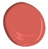
While this colour may be bold and electric, it’s warmth and intrigue make it a colour that will work well in many homes, even if its just as an accent.
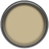
Dulux chose a gentle warm gold with hints of green, called Wild Wonder, for its colour of the year. This relaxed and natural colour is versatile, pairing with many other colours seamlessly.
Inspired by the warm tones of harvested crops, Wild Wonder helps bring the outside in, which is not only a big trend in home decorating, but it also promoted good physical and mental health.
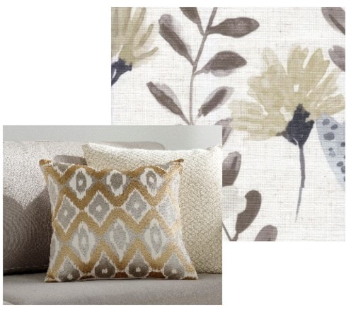
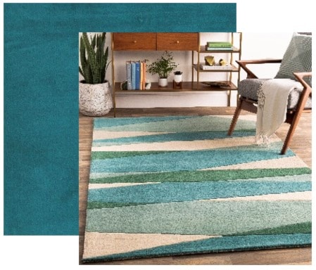
Glidden picked a Vining Ivy (PPG1148-6), a colour that is a subtle, yet more intriguing version of the neutral greens that defined 2022. While it still has the nods to nature, evoking tranquility and a sense of grounding, this colour has more of a pop and boldness to it.

Vining Ivy is a colour with endless possibilities. Not only does it pair well with all styles from more classic to contemporary ones, it also pairs well with many colours and materials, including natural woods and stone accents.

Pantone went bold with this year’s colour of the year, choosing Viva Magenta (18-1750). This colour is meant to turn heads, but it is as alluring as it is accessible.
This red-meets-pink colour may be unconventional, but its an unconventional time. It is a confident colour designed to make a statement, big or small, so don’t be afraid to incorporate it into your home. Pair it with some soft blues, greens and beiges for a fun, yet cozy feel.
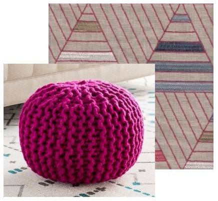
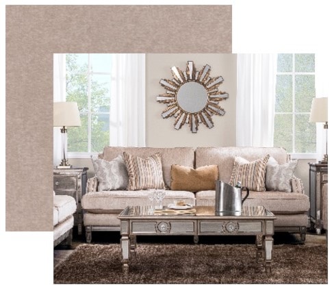
Sherwin Williams' colour of the year is Redend Point (SW 9081). This colour is a perfect blend of beige and blush that can act as a neutral.

It is an earthy tone with a desert-like feel. It was chosen as an extension of the nature inspired tones that have been popular for the last few years and will continue to be for years to come. It was also chosen due to its symbolism of empathy and care.
We love all these colours of the year as we feel they are bright and refreshing, which is perfect for what we want this year to bring.
While there may be hesitancy to use some of these brighter colours in your home, we’re here to tell you not to be afraid. If you want to make an impact, talk to our knowledgeable Decorator Consultants about how to incorporate them into your space. You can also start by dipping your toe in the water, bringing in these colours with accessories.
Here’s how we made them all work together.
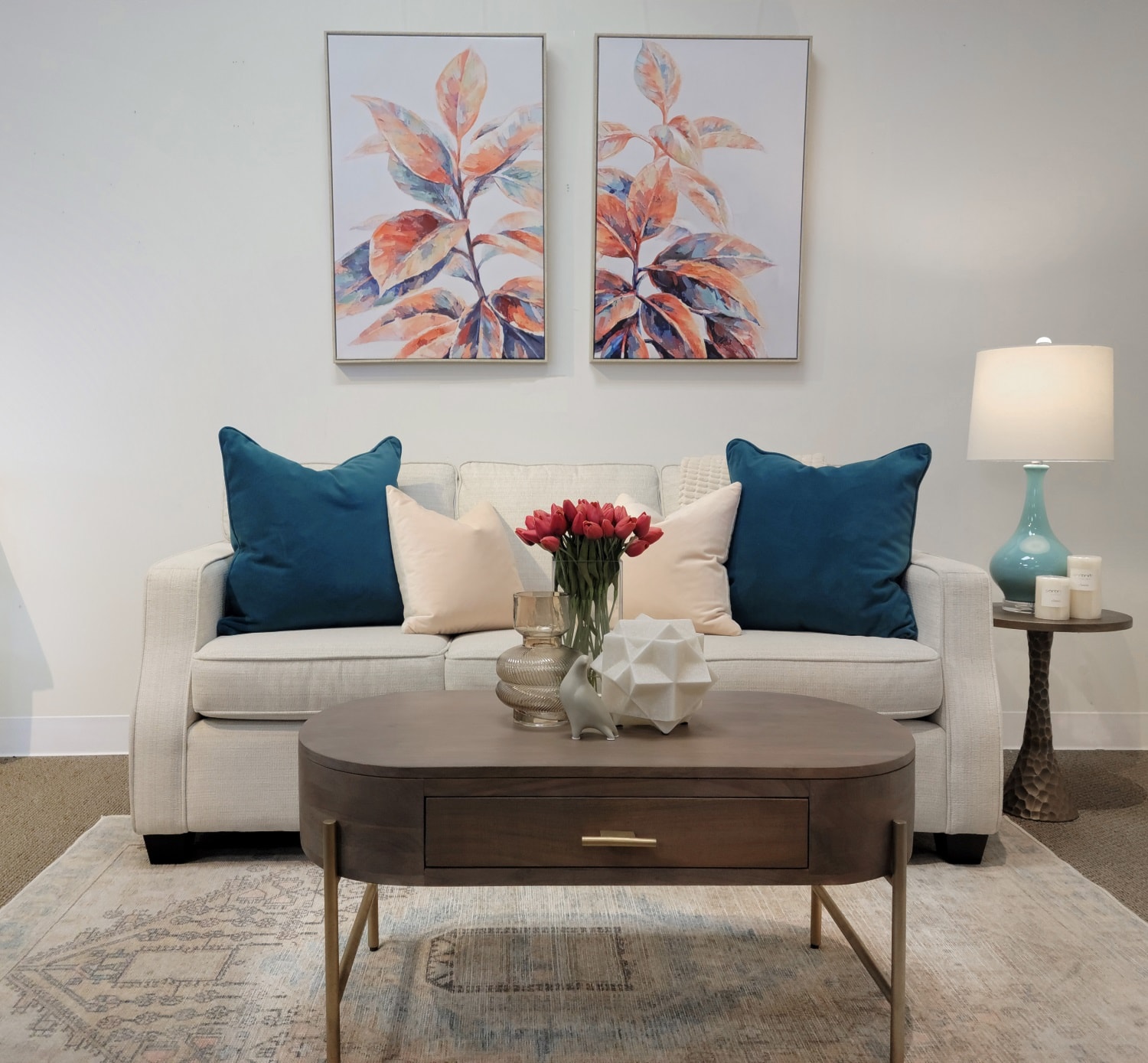
This room set up was designed to not only showcase all the colours of the year, but to also evoke all the feelings each individual colour represents. It is bold, yet still inspired by nature. It grabs your attention while still be refreshing and mindful.
What 2023 colour of the year is your favourite?

